 Books : Mastering Borland Delphi 2005: Update for Delphi 2006
Mastering Delphi Update for Delphi 2006
Chapter 6
The VCL in Delphi 2006
The VCL library in Delphi 2006 has genuine improvements in positioning and laying out visual controls. I haven't seen such a helpful set of changes to the VCL in a new version of Delphi for many years!
As we'll see shortly, it is possible to define the minimum distance among visual controls, with techniques borrowed from the development of web pages, and to use special controls layouts within hosting panels. There are also some other new components, beside the layout panels, but they are not so important.
All of the new changes related with the VCL are described in update material of Chapter 6, even if they relate to controls described in Chapters 7 and 8 of “Mastering Borland Delphi 2005”.
The VCL for .NET has been enhanced as well, to keep it up to date with its Win32 counterpart. For this reason, the new features discussed in the update material for Chapter 6 apply also to the .NET version of the VCL.
Margins and Padding
To define relative positions among the controls placed on a form, Delphi 2006 adds two new properties to the the TControl class, Margins and Paddings.
The margins (defined by the TMargins data structure, which has four sub-properties for each of the sides of the controls) provide the “vital” space around a control. This implies that if a control is aligned to a side of the containing form, it will not touch the form border any more but will leave the proper margin. The same is true of two sibling controls aligned one close to another: they'll be set apart by the number of pixels corresponding to the sum of the respective margins. In the image below you can see two panels with alTop alignment, both having a 3 pixel margin on each side:
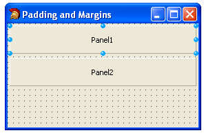
If the first panel is placed 3 pixels below the form border, the two panels are separated by a 6 pixels margin (3 pixels each). This behavior is turned on only if the AlignWithMargins property is set to True. The default of the property is False to avoid any existing forms being automatically changed as you open them in the new IDE.
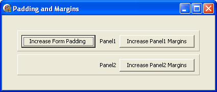
The Padding property, of type TPadding, is used by a container control (form, panel, page of a PageControl) to set a border inside the container that has to remain free from aligned child controls. In practice this means that the distance of a control from the border of its Parent controls equals its own margin plus the padding of the container control. In the figure below you can see the form of the MarginsPadding example, with a rather large padding area:
Margins and padding define only a default position, and become compulsory only for controls using the Align property and only when the AlignWithMargins property is set to True, as already mentioned. The Form Designer, however, snaps controls to the proper margins and padding helping a developer follow those non-compulsory indications. The use of these properties is very interesting in general, but it becomes vital in conjunction with the new layout panels, described in the next section.
Layout Panels
Until Delphi 2005, the VCL had the option to place components in an absolute position (Left and Top property), or in a position relative to one of the form margins (Anchors property), or use automatic alignments (Align property). Only some of the component containers, like the RadioGroup or the new (in Delphi 2005) ButtonGroup, manage the position of the internal controls in an automatic way. If you resize these container controls, the components they host are properly moved, aligned, or resized to keep the user interface balanced.
The new layout panels push the VCL even further in this direction, introducing the use of HTML layout techniques, similar to some Java user interface libraries. Delphi 2006 introduced two such panels in the VCL: the FlowPanel control and the GridPanel control.
The FlowPanel shows the child controls it hosts in sequence, one after the other, regardless of their position (where you place them at design time or the value of their positional properties). Relative distances are controlled by margins and padding. Whether the sequence is left to right and top to bottom, or top to bottom and left to right, or any of the other six combinations, is determined by the FlowStyle property. The default value is fsLeftRightTopBottom, which for a set of sequentially numbered check boxes produces an output like this:
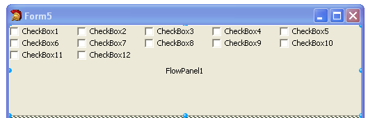
It is interesting to notice what happens to the check boxes as you resize the form (and the top aligned panel). Automatic changes in the user interface, with controls adjusting their position, also take place if you change the Caption of a control (as this affects the size of the control itself). I suggest you to try running an example like this to see for yourself how it works (you can find the AutoPanels example among those related with this ebook).
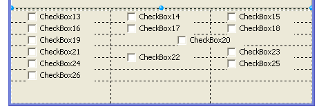
The GridPanel, instead, offers a grid of cells, inside which you can add controls. Controls are added one after the other in the first available cell, one in each cell. The size of the rows and columns can be automatic, absolute, or percentage (although setting the percentage size can be tricky as the other columns or rows automatically adapt to these changes). You can ask the grid to automatically add new columns or rows as needed, using the ExpandStyle property. You can see the details of the rows and columns using the collection properties ColumnCollection and RowCollection.
I suggest you try to set the proper number of rows and columns up-front whenever possible. When you add new cells, in fact, you have to manually rearrange the control, if needed. The grid designer doesn't support dragging, so to move the controls you have to use the Column e Row fake properties. (Fake because they show up at the end of the properties list in the Object Inspector, but they aren't properties of the given control, but are added by its GridPanel parent!). Two other fake properties added when you select a control from the gird are ColumnSpan and RowSpan, which as the corresponding HTML cell attributes allow you to have a controls that are bigger than the others and use multiple rows or columns.
In the following figure you can see an example of a grid panel at design time, with a set of numbered check boxes (again part of the AutoPanels example). Notice that one of the controls (number 20) covers two cells of the same row, another (number 22) uses two rows of the same column:
The TrayIcon Component
For the first time the VCL in Delphi 2006 also includes a TrayIcon component to add an icon in the Windows Tray Icon area while the program is running. There are a number of free third party components for this purpose, but including one in the official set of VCL components is a good idea.
Using this component is quite simple. You drop it on one of the forms of the application (if you add more than one, only the first will be displayed, the others will be ignored), set the icon to show, add a hint for the user (when the cursors moves over the icon), and a popup menu to display (when the TrayIcon is clicked). The code will look something like this:
object TrayIcon1: TTrayIcon
Animate = True
Hint = 'short hint'
BalloonHint = 'sample balloon hint'
BalloonTitle = 'hi'
BalloonFlags = bfInfo
Icon.Data = {...}
PopupMenu = PopupMenu1
Visible = True
end
object PopupMenu1: TPopupMenu
object one1: TMenuItem
Caption = 'one'
Default = True
end
object two1: TMenuItem
Caption = 'two'
end
object three1: TMenuItem
Caption = 'three'
end
object four1: TMenuItem
Caption = 'four'
end
end
This code is generally used in applications which have their main form hidden by default, an effect you can achieve by simply adding the following line to the project source code:
Application.ShowMainForm := False;
In this case, you need to add an event handler to the popup menu to display the form, as I've done in the MyTrayIcon example:
procedure TForm4.one1Click(Sender: TObject);
begin
Show;
end;
The VCL TrayIcon components has also set of properties related with the balloon hint, BalloonFlags, BalloonHint, BalloonTimeout, and BalloonTitle. However these features work only if the user has a Windows Explorer specific setting enabled in the HKEY_CURRENT_USER section of the registry (that is, if the EnableBalloonTips key under Software\Microsoft\Windows\CurrentVersion\Explorer\Advanced is set to 1).
Other New Features of the VCL
Beside these major new features, the VCL in Delphi 2006 has many minor improvements worth mentioning:
All controls have improved support for the OnMouseEnter and OnMouseLeave events, which are not mapped to Windows messages but are implemented internally in the VCL, now using specific system support. There is also a new MouseInClient property for the TWinControl class.
Accessibility support for ActionBars, through the TActionBarAccessibility class of the new ABAccessibility unit. The various components and controls of the ActionManager architecture have been extended with this support, and also with a few other improvements (and some bug fixes). There is also better support for actions in the BitBtn and SpeedButton controls.
You can have a ToolBar or a ControlBar control with a gradient background.
There is a new class TCustomTransparentControl, capable of receiving mouse input.
There is a new set of overload functions similar to MessageDlg, in which you can specify the default button.
You can determine the default popup behavior for all the forms of an application using the new PopupMode property of the Application global object. If you set this property to match what's needed for most forms, they'll be already be created with the proper window styles. This means when invoking the ShowModal call you don't face the risk of having the actual window being recreated by the VCL with different settings, at times causing initialization problems for the forms. These were caused by the introduction of the PopupMode property in the TForm class in Delphi 2005. (For the rationale for having this property to avoid the “modal form behind the main form bug in Windows XP” see Mastering Delphi 2005).
You can activate the full mouse wheel support by adding to the Uses statement the IMouse unit. The actual behavior of the wheel can be tuned with the new Panning property that has been added to most controls.
When you change the FormStyle, BorderStyle, and BorderIcons properties of a form Delphi doesn't need to recreate the handle of the form window any more.
To simplify the migration from computers with small fonts to those that use large fonts, the default value of the AutoScroll property of the forms has been change to False (so that the forms will try to resize automatically, instead of showing scrollbars, as partially introduced in Chapter 7 of the book Mastering Borland Delphi 2005).
The global Application object has a new method with a self-descriptive name, HelpShowTableOfContents.